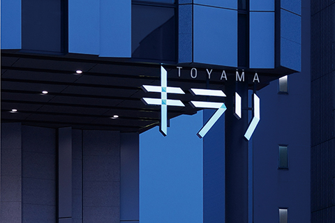
 Vertical lattice has become a major motif of the building’s design, in such things as its façade and in the internal louvers, and the logo design has also been made to match this in its use of glass-like, rectangular panels. At a glance it gives one the impression of the transparency of glass and of the building’s image. The colors used are the jade green and blue that are produced at Toyama Glass Studio. The jade green expresses pleasure in harmony with nature and the calm of a cultural institution. The blue expresses a clear spirit like the blue of Toyama Bay, which is also called aigame after the earthenware pots used to store indigo dye.


